> ## Documentation Index
> Fetch the complete documentation index at: https://docs.nozle.dev/llms.txt
> Use this file to discover all available pages before exploring further.
# Components
> Pricing, checkout, billing, usage, and customer-facing React components.
The React SDK separates public catalog and checkout orchestration from customer state:
* `PricingTable` may load the public catalog with a publishable key.
* Checkout components call your `BillingProvider.createCheckout` callback.
* Gates, usage widgets, badges, and payment-method UI consume caller-supplied state.
## Pricing components
 ### `PricingTable`
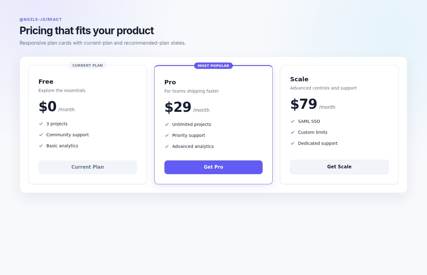
Renders responsive plan cards, an optional monthly/annual toggle, current-plan state, highlighted plans, and checkout actions.
```tsx theme={null}
import { PricingTable } from '@nozle-js/react'
```
When `plans` is omitted, `PricingTable` reads `GET /api/v1/plans` through `BillingProvider`. Supplying `plans` makes the component fully caller-driven and allows it to render outside a provider when `onSelect` is also supplied.
| Prop | Type | Default | Description |
| ---------------------- | ------------------ | ----------------- | -------------------------------------------------------- |
| `currentPlanCode` | `string` | — | Plan displayed as current and disabled. |
| `plans` | `PricingPlan[]` | Public catalog | Caller-supplied plan list. |
| `features` | `string[][]` | — | Feature lists aligned to the rendered plan order. |
| `onSelect` | `(plan) => void` | Provider checkout | Overrides built-in checkout selection. |
| `returnUrl` | `string` | Current URL | Return URL sent to `createCheckout`. |
| `onStripeClientSecret` | `(secret) => void` | — | Receives embedded Stripe checkout secrets. |
| `onCheckoutResult` | `(result) => void` | — | Receives every raw checkout result. |
| `onCheckoutError` | `(error) => void` | — | Receives catalog-selection or checkout errors. |
| `showToggle` | `boolean` | `true` | Shows monthly/annual filtering when yearly plans exist. |
| `highlightPlan` | `string` | — | Plan code marked “Most Popular.” |
| `className` | `string` | — | Class applied to the root container. |
| `enterpriseEmail` | `string` | — | Opens a prefilled mail link for enterprise/custom plans. |
`PricingPlan` contains `code`, `name`, `amount_cents`, `amount_currency`, `interval`, and optional `description`.
### `PlanCard`
Use `PlanCard` when you already have a custom pricing layout and want an individual card.
```tsx theme={null}
startCheckout(planCode, returnUrl)}
/>
```
Prices are expressed in major currency units for this presentational component, not cents.
### `PlanComparison`
Renders a side-by-side feature table. Each feature maps plan IDs to a string or boolean.
```tsx theme={null}
```
## Checkout components
### `CheckoutButton`
Starts checkout through `BillingProvider.createCheckout` and handles hosted Stripe, embedded Stripe, Razorpay, completed, and scheduled results.
```tsx theme={null}
refreshBillingStatus()}
onScheduled={() => refreshBillingStatus()}
onError={setError}
/>
```
| Prop | Type | Default | Description |
| ---------------------- | --------------------- | ------------- | ------------------------------------------ |
| `planCode` | `string` | required | Plan passed to `createCheckout`. |
| `returnUrl` | `string` | Current URL | Validated merchant return URL. |
| `label` | `string` | `Get Started` | Button label. |
| `className` / `style` | React styling props | — | Button styling overrides. |
| `razorpayKeyId` | `string` | — | Browser key for Razorpay checkout results. |
| `onStripeClientSecret` | `(secret) => void` | — | Required for embedded Stripe results. |
| `onSuccess` | `(paymentId) => void` | — | Razorpay success callback. |
| `onComplete` | `(result) => void` | — | Immediate completed-result callback. |
| `onScheduled` | `(result) => void` | — | Scheduled-change callback. |
| `onError` | `(error) => void` | — | Checkout failure callback. |
### `Checkout`
Renders Stripe Payment Element checkout for a client secret returned by your merchant backend.
```tsx theme={null}
console.log(paymentIntentId)}
onComplete={() => refreshBillingStatus()}
onError={setError}
/>
```
| Prop | Type | Default | Description |
| --------------------- | --------------------------- | -------------------- | -------------------------------------------------- |
| `clientSecret` | `string` | required | Stripe PaymentIntent or SetupIntent client secret. |
| `publishableKey` | `string` | required | Stripe publishable key. |
| `stripeAccount` | `string` | — | Connected account ID. |
| `returnUrl` | `string` | Current URL fallback | Stripe redirect URL. |
| `submitLabel` | `string` | `Pay now` | Submit button label. |
| `onSuccess` | `(paymentIntentId) => void` | — | Successful PaymentIntent callback. |
| `onComplete` | `() => void` | — | Checkout completion callback. |
| `onError` | `(error) => void` | — | Stripe or validation failure. |
| `onReady` | `() => void` | — | Payment Element ready callback. |
| `className` / `style` | React styling props | — | Root styling. |
| `children` | `ReactNode` | — | Additional content above the submit button. |
The `useCheckout` export from this component must be called inside the component's Stripe Elements context. It returns `confirmPayment`, `isProcessing`, and `error`. Do not confuse it with `useCheckoutSession`, which creates checkout through your merchant callback.
Stripe webhook processing is authoritative. `onSuccess`, `onComplete`, and return-page navigation are user-interface signals, not proof that a subscription is active.
## Plan-change components
### `PricingTable`
Renders responsive plan cards, an optional monthly/annual toggle, current-plan state, highlighted plans, and checkout actions.
```tsx theme={null}
import { PricingTable } from '@nozle-js/react'
```
When `plans` is omitted, `PricingTable` reads `GET /api/v1/plans` through `BillingProvider`. Supplying `plans` makes the component fully caller-driven and allows it to render outside a provider when `onSelect` is also supplied.
| Prop | Type | Default | Description |
| ---------------------- | ------------------ | ----------------- | -------------------------------------------------------- |
| `currentPlanCode` | `string` | — | Plan displayed as current and disabled. |
| `plans` | `PricingPlan[]` | Public catalog | Caller-supplied plan list. |
| `features` | `string[][]` | — | Feature lists aligned to the rendered plan order. |
| `onSelect` | `(plan) => void` | Provider checkout | Overrides built-in checkout selection. |
| `returnUrl` | `string` | Current URL | Return URL sent to `createCheckout`. |
| `onStripeClientSecret` | `(secret) => void` | — | Receives embedded Stripe checkout secrets. |
| `onCheckoutResult` | `(result) => void` | — | Receives every raw checkout result. |
| `onCheckoutError` | `(error) => void` | — | Receives catalog-selection or checkout errors. |
| `showToggle` | `boolean` | `true` | Shows monthly/annual filtering when yearly plans exist. |
| `highlightPlan` | `string` | — | Plan code marked “Most Popular.” |
| `className` | `string` | — | Class applied to the root container. |
| `enterpriseEmail` | `string` | — | Opens a prefilled mail link for enterprise/custom plans. |
`PricingPlan` contains `code`, `name`, `amount_cents`, `amount_currency`, `interval`, and optional `description`.
### `PlanCard`
Use `PlanCard` when you already have a custom pricing layout and want an individual card.
```tsx theme={null}
startCheckout(planCode, returnUrl)}
/>
```
Prices are expressed in major currency units for this presentational component, not cents.
### `PlanComparison`
Renders a side-by-side feature table. Each feature maps plan IDs to a string or boolean.
```tsx theme={null}
```
## Checkout components
### `CheckoutButton`
Starts checkout through `BillingProvider.createCheckout` and handles hosted Stripe, embedded Stripe, Razorpay, completed, and scheduled results.
```tsx theme={null}
refreshBillingStatus()}
onScheduled={() => refreshBillingStatus()}
onError={setError}
/>
```
| Prop | Type | Default | Description |
| ---------------------- | --------------------- | ------------- | ------------------------------------------ |
| `planCode` | `string` | required | Plan passed to `createCheckout`. |
| `returnUrl` | `string` | Current URL | Validated merchant return URL. |
| `label` | `string` | `Get Started` | Button label. |
| `className` / `style` | React styling props | — | Button styling overrides. |
| `razorpayKeyId` | `string` | — | Browser key for Razorpay checkout results. |
| `onStripeClientSecret` | `(secret) => void` | — | Required for embedded Stripe results. |
| `onSuccess` | `(paymentId) => void` | — | Razorpay success callback. |
| `onComplete` | `(result) => void` | — | Immediate completed-result callback. |
| `onScheduled` | `(result) => void` | — | Scheduled-change callback. |
| `onError` | `(error) => void` | — | Checkout failure callback. |
### `Checkout`
Renders Stripe Payment Element checkout for a client secret returned by your merchant backend.
```tsx theme={null}
console.log(paymentIntentId)}
onComplete={() => refreshBillingStatus()}
onError={setError}
/>
```
| Prop | Type | Default | Description |
| --------------------- | --------------------------- | -------------------- | -------------------------------------------------- |
| `clientSecret` | `string` | required | Stripe PaymentIntent or SetupIntent client secret. |
| `publishableKey` | `string` | required | Stripe publishable key. |
| `stripeAccount` | `string` | — | Connected account ID. |
| `returnUrl` | `string` | Current URL fallback | Stripe redirect URL. |
| `submitLabel` | `string` | `Pay now` | Submit button label. |
| `onSuccess` | `(paymentIntentId) => void` | — | Successful PaymentIntent callback. |
| `onComplete` | `() => void` | — | Checkout completion callback. |
| `onError` | `(error) => void` | — | Stripe or validation failure. |
| `onReady` | `() => void` | — | Payment Element ready callback. |
| `className` / `style` | React styling props | — | Root styling. |
| `children` | `ReactNode` | — | Additional content above the submit button. |
The `useCheckout` export from this component must be called inside the component's Stripe Elements context. It returns `confirmPayment`, `isProcessing`, and `error`. Do not confuse it with `useCheckoutSession`, which creates checkout through your merchant callback.
Stripe webhook processing is authoritative. `onSuccess`, `onComplete`, and return-page navigation are user-interface signals, not proof that a subscription is active.
## Plan-change components
 ### `UpgradeButton`
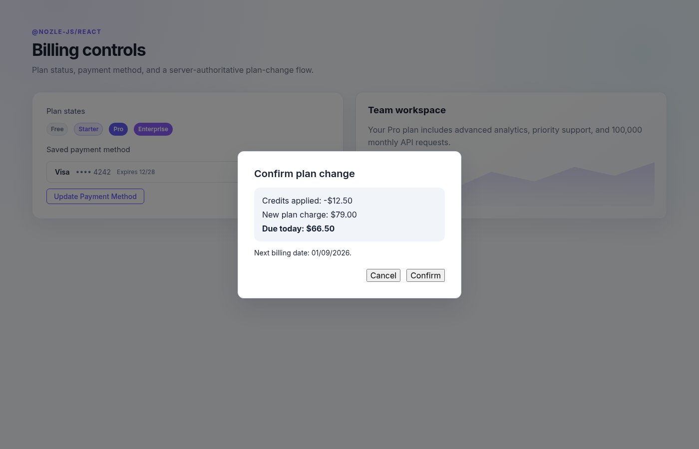
Opens `UpgradeModal` and starts a plan change through the provider callback.
```tsx theme={null}
```
The component also accepts `returnUrl`, `className`, `style`, `onCheckoutStarted`, and `onError`.
### `UpgradeModal`
Use the modal directly when your application owns its open state.
```tsx theme={null}
setUpgradeOpen(false)}
onCompleted={refreshBillingStatus}
onScheduled={refreshBillingStatus}
onStripeClientSecret={setClientSecret}
/>
```
`preview` is caller-supplied and contains `credit`, `debit`, `net`, and `nextBillingDate`. The modal does not request a customer preview from the browser.
## Billing display components
### `PlanBadge`
```tsx theme={null}
```
`tier` controls presentation and accepts `free`, `starter`, `pro`, or `enterprise`.
### `PaymentMethodDisplay`
```tsx theme={null}
openPaymentMethodFlow()}
/>
```
Without `onUpdatePaymentMethod`, the update button navigates to `updateHref`, which defaults to `/billing/update-payment`. Omit `paymentMethod` to show the empty state.
## Usage components
### `UpgradeButton`
Opens `UpgradeModal` and starts a plan change through the provider callback.
```tsx theme={null}
```
The component also accepts `returnUrl`, `className`, `style`, `onCheckoutStarted`, and `onError`.
### `UpgradeModal`
Use the modal directly when your application owns its open state.
```tsx theme={null}
setUpgradeOpen(false)}
onCompleted={refreshBillingStatus}
onScheduled={refreshBillingStatus}
onStripeClientSecret={setClientSecret}
/>
```
`preview` is caller-supplied and contains `credit`, `debit`, `net`, and `nextBillingDate`. The modal does not request a customer preview from the browser.
## Billing display components
### `PlanBadge`
```tsx theme={null}
```
`tier` controls presentation and accepts `free`, `starter`, `pro`, or `enterprise`.
### `PaymentMethodDisplay`
```tsx theme={null}
openPaymentMethodFlow()}
/>
```
Without `onUpdatePaymentMethod`, the update button navigates to `updateHref`, which defaults to `/billing/update-payment`. Omit `paymentMethod` to show the empty state.
## Usage components
 ### `UsageMeter`
```tsx theme={null}
```
| Prop | Type | Default | Description |
| ---------- | --------- | -------- | ------------------------------------------------------ |
| `used` | `number` | required | Current usage. |
| `limit` | `number` | required | Usage limit. |
| `label` | `string` | — | Label above the bar. |
| `showText` | `boolean` | `true` | Shows the numeric used/limit text when a label exists. |
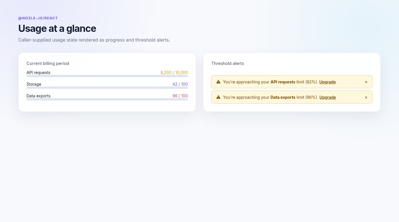
The fill uses the primary color below 80%, warning from 80–94%, and destructive at 95% or above. `getUsageMeterColor(percentage)` exposes the same threshold selection.
### `UsageDashboard`
```tsx theme={null}
```
Pass `loading` to render three skeleton rows. `features` defaults to an empty array.
### `UsageAlert`
```tsx theme={null}
```
The component renders one dismissible warning for each feature at or above `threshold`. The default threshold is `80` and the default upgrade link is `/plans`.
## Access-control components
`FeatureGate`, `UsageGate`, `PlanGate`, `UpgradePrompt`, and `LockedOverlay` are documented on [Feature gates](/sdks/react/gates).
### `UsageMeter`
```tsx theme={null}
```
| Prop | Type | Default | Description |
| ---------- | --------- | -------- | ------------------------------------------------------ |
| `used` | `number` | required | Current usage. |
| `limit` | `number` | required | Usage limit. |
| `label` | `string` | — | Label above the bar. |
| `showText` | `boolean` | `true` | Shows the numeric used/limit text when a label exists. |
The fill uses the primary color below 80%, warning from 80–94%, and destructive at 95% or above. `getUsageMeterColor(percentage)` exposes the same threshold selection.
### `UsageDashboard`
```tsx theme={null}
```
Pass `loading` to render three skeleton rows. `features` defaults to an empty array.
### `UsageAlert`
```tsx theme={null}
```
The component renders one dismissible warning for each feature at or above `threshold`. The default threshold is `80` and the default upgrade link is `/plans`.
## Access-control components
`FeatureGate`, `UsageGate`, `PlanGate`, `UpgradePrompt`, and `LockedOverlay` are documented on [Feature gates](/sdks/react/gates).